
5 Principles of Web Design

The way a website is designed can truly impact the way that website is used and operated. Something that looks awful on the internet won't drive a lot of traffic, but something that looks amazing might. Proceed with caution though. Just because a website looks amazing does not mean that it was designed well. If an audience can't navigate the site efficiently and get to exactly where they want to be, then the beautiful design is pointless. Here are some tips to help anyone trying to create their own website.
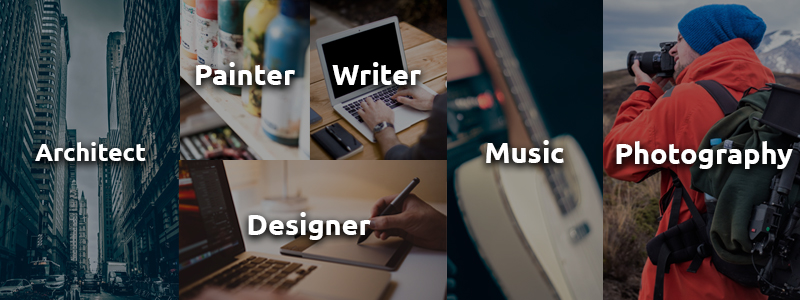
#1.) You paint photos.... right?
Every website has a purpose, and the website has to make that clear. On the first page of navigation, typically the homepage, there should be some explanation of what that is. For example, on my website, my landing page includes a little bit about me, and all my social media links. I made this choice because if a client is just looking to contact me, which happens often, they do not have to go deep into my site. They have all of the links right there on the welcome page. Quick and easy for my audience. The entire purpose of my website is contained in a one stop shop welcome page that invites them to come deeper into the site if they feel the need to. (edit: as of 2/2/2016 this fact has been changed. Now I direct my clients into my site and to my about page, same purpose, less clutter.)
#2.) It's not a maze.
Clear navigation is an essential part of any website's design. A visitor to a website needs to know where to go to get what they want. The clearer the better. This does get very tricky though. Too many navigation links and people won't have any sense of direction. Not enough navigation links and people won't know where to go at all. The key is grouping. Condense similar pages into categories to show a user where to go. The most important part of the navigation is picking the right pages to link. The pages that are most frequently visited should have primary links in main navigation, and then pages that are still important, but not quite popular, can have their own links in the secondary navigation. The more simple and elegant the navigation the better. You can see some really great examples: here.
#3.) caN U ReAd dIsS?
Typography. This itself could be an entire new blog, but I will cover it the best I can in the next couple paragraphs. Typography is the use of fonts and lettering to create a feeling and conformity throughout your design. Bad typography is very noticeable and something that will make a site visitor very uncomfortable. There have been numerous studies done on different type forms and what they do to your eyes, so make sure to do a little bit of research before you begin.
The two biggest rules to follow are about type of font and size of font. There are two types of type common on a website: Sans-serif and serif. Serif fonts are something that you would see in a book or text, they are very elegant finished fonts that have 'serifs' on the end. A Sans-serif font is something usually used for small blocks of text and headings. This is a rule that can and will be broken a lot, but when you are first starting out it is better to use the 'correct' one for each purpose. As you develop your site you will be more comfortable and can start to play around with the type.
- Generally you should use a serif font for bodies of text that do not have many breaks in between.
- A sans-serif font is great for headers, sub-headers, and any information. It is easier for the visitor to read at a glance, and will draw their attention.
- There should be no more than 3 type faces
- There should be no more than 3 sizes of type on your website. Keeping a consistent feel will make the visitor more comfortable.
The other big issue with typography is size. I can't count the amount of times I have been on a website that has really reaLLY REALLY big font for simple blocks of text. Here are some general guidelines to follow:
- The best size for text on a webpage is 14-16px depending on your platform.
- Play with this one a little bit, each site is just a little bit different. Look at the site on multiple platforms or computers, and see what works best.
- As stated above, keep your sizes consistent.
Also, be aware of fonts that should never be used. Some examples include jokerman, chiller, and anything with bubble letters.
For a great experience with typography and to learn a little bit more about it, head over to Type Wolf; it is a great website to learn and discover new typography and ways to use it.

#4.) Pepsi has the red cans?
Color is another tricky tool. But again, is a very useful one. The most important thing you can do with the colors on your website is to make sure that they match and reflect your brand image. For example, you look at Pepsi's website they don't really use a whole lot of red. That would be very confusing to their visitors. It would make them uncomfortable because they do not associate the color red with Pepsi.
Colors can also be used to draw attention. Using a different colors for links and headers is a great way for people to recognize where you want them to go and what is important. You see it all the time, especially on bad websites. Remember the big flashing yellow stars where people would put, "BUY THIS THING FROM THIS GUY RIGHT NOW AND SAVE!" Really awful advertisement, but that color drew your attention didn't it?
#5.) 60% of you are on your phone.
A study done by Small Business Trends showed that around 60% of website visitors are now on mobile devices. This includes anything that is not a computer. Phones, music players, tablets, unnecessarily big tablets (iPad Pro), and other devices. The truth is anybody designing a website has to be able to adapt the site to them. If the majority of your audience is on something and you are making it difficult for them to see, you are going to lose that audience. There are numerous tutorials on how to develop for the web and how to make your website responsive. Responsive meaning that no matter how big the screen, your website is still viewable and still maintains its purpose.
Below is an example of my website on the computer and on a phone screen. I took the 'easier' (taken with a grain of salt) route of using an online web builder so that they did all the responsive work for me. I use a service called SquareSpace. The great thing is that they handle most of the coding and make it very easy for content to adapt to a different screen. Even better, is that they have really great custom tools for me to integrate my own personal style into the site. So even though I started with a template, I have changed and tweaked so much on this site that somebody using the same template would have a long road ahead to copy exactly what I have.

Full size website on the computer, with the mobile site view in the bottom right.
If you are creating a new website, or updating an old one you can use these 5 basic guidelines to make it look great. In a world adapting to online culture, it is important to make sure that anything published online looks great. Look closely next time you read an article and pay attention to the website. Even the websites with the illegitimate articles and stories that nobody actually needs to read usually have a decent site layout and design. It is something that nobody really notices, until it's really bad. If you see a bad design you are more likely to leave the page without knowing why, where as a good design can keep you locked into a website for a decent period of time.
In the end, your website is going to be a representation of you or your brand. Don't try to copy other websites that may not be a good view of that. Instead, find a bunch of websites that you like and take the best elements of each one and incorporate them into the vision that you had. As I always say, if you really want to accomplish a great design you can. Just make sure you follow your vision, stay true to who you are, and create something amazing.
Until Next Time,